CSS scale content while keeping aspect ratio
August 22, 2019
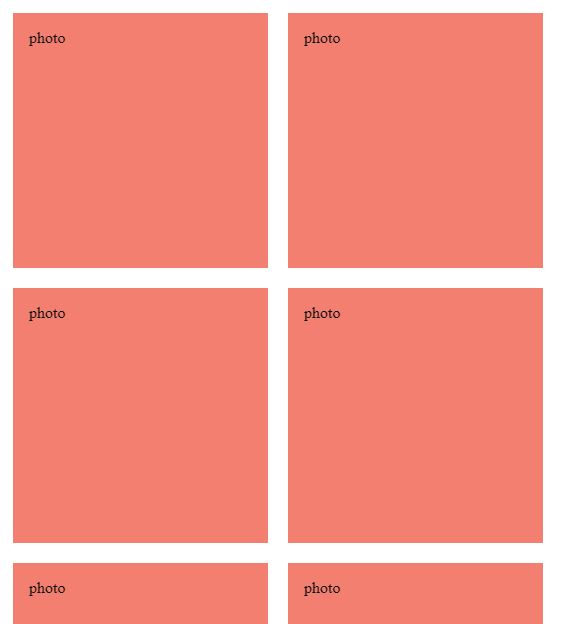
There sometimes we have a div like these :

But we would like independently of the screen size, they should always be square, which means has exactly the same height as width (which is always 50%), or in order word, we would like to scale it while keeping the same aspect ratio.
The trick is use padding in percentage, why?
padding in percentages is based on width.
Which means, if width is 400px and padding-top is 100%, it will create a padding top of 400px!
eg. in our case:
.aspect-ratio-box {
  width: 50%;
  padding-top: 50%;
}
we can create a padding with exact same of the width (50% of the screen)

Now we can just position absolute the photo element and fill the container
.aspect-ratio-box {
  width: 50%;
  padding-top: 50%;
  position: relative
}

.photo {
  position: absolute;
  top: 0;
  left: 0;
  bottom: 0;
  right: 0;
  background: salmon;
  ...
}
and we will get the desired look;
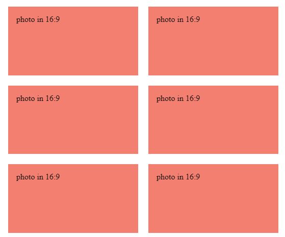
Using the same concept we can also force the div to be 4:3 ratio or 16:9 ratio;
eg: 3/4 = 75% or 9/16 = 56.25%
sample code: https://codepen.io/kossel/pen/BaBQMYB